
Three weeks of user research and 47 customer interviews led to this: a redesigned ShipOS dashboard that cuts the time to understand project status from 30 seconds to 3 seconds.
What changed
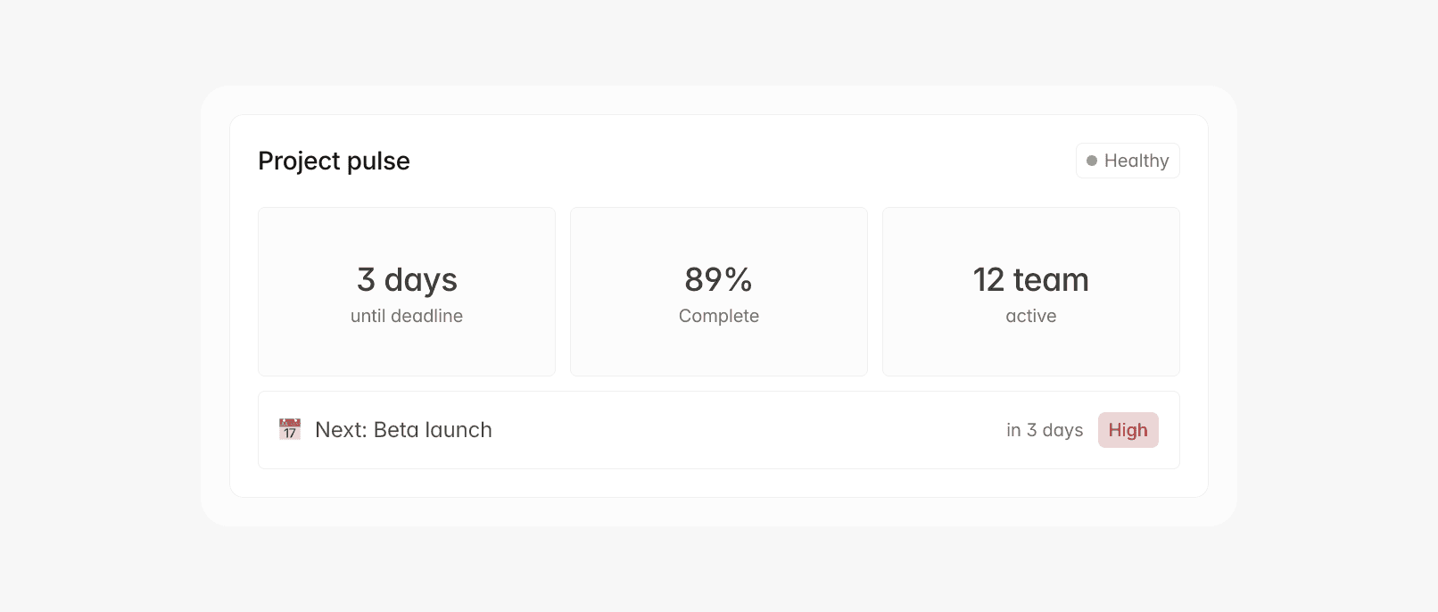
The biggest update is our new Project Pulse view—a single card showing project health, upcoming deadlines, and team activity at a glance. No more clicking through tabs to answer "How are we doing?"
We redesigned the milestone timeline as an interactive flow that shows dependencies and bottlenecks. Teams can spot potential delays two weeks earlier than before.
The sidebar now surfaces quick actions based on your role. Project owners see different options than contributors, and urgent items automatically move to the top with a priority: high flag.
Why we changed it
User research revealed people weren't using 60% of dashboard features—not because they weren't useful, but because they couldn't find them quickly enough.
"I'd spend the first minute every morning figuring out what needed attention," said Jennifer Liu from Cloudbase. "Now I see it immediately."
We also discovered that different roles check different metrics. Designers focus on milestone.dependencies, developers track blocker.status, and project managers need the overall health.score view.
Performance improvements
The dashboard now loads 65% faster. We rebuilt data queries to fetch only what's visible:
We also added smart caching:
Plus webhook integration for real-time updates:
Early results
Since rolling out to beta users:
28% increase in daily usage
40% fewer support tickets about finding information
92% satisfaction rating (up from 78%)
The update is rolling out to all users this week. We'd love your feedback—hit the feedback button or email us directly.
John Jansen
·